


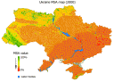
The comparison by mean value per oblasts of Ukraine: 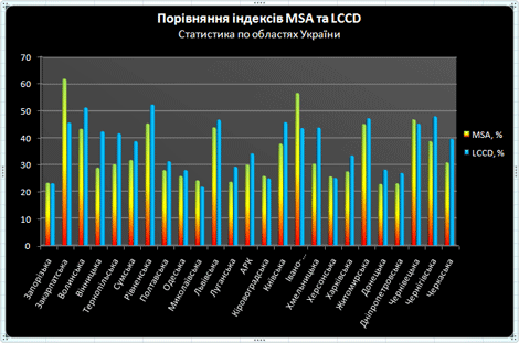 . Moreover, you can compare the LCCD (LCCD_bio) and MSA maps with the same color scheme:
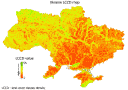
Categories: Bd Training Package
The comparison by mean value per oblasts of Ukraine: . Moreover, you can compare the LCCD (LCCD_bio) and MSA maps with the same color scheme:
1 Comment
Vasyl Prydatko · Wednesday March 5th, 2008 at 02:07 PM
I.e. MSA model (1 sq.km per grid), and
Ukraine LCCD_Bio model (0,0025 sq.km per grid).